It’s official folks, market fundamentals are no longer needed so long as the Fed has our back–which it will eventually stab, as it always inadvertently does…
42 shares
January 2020 is about to join 2019 in the rear-view mirror. While past market performance is never a reliable indicator of future results, market peaks seen in January can be informative.
What we’re seeing now are crazy markets rising way past the market fundamentals of normal price risk. Below we back this with facts and advice, not just bewildered eyes.
So, we’ll start this Monday’s Signals Matter Report by looking back…so we can spring forward/think ahead.
To take you behind our tent, we’ve prepared a simple chart that shares, dissects and broadly informs on What’s Happening Now as it relates to market fundamentals.
Buckle up: This Signals Matter Report is going to be chart-heavy but easy to follow. After all, a picture is often worth a thousand words and a few market fundamentals.
Let’s Dig In
The chart below compares daily data on stocks (the S&P 500 Index), bonds (investment grade) and commodities, benchmarked against strategies that trade them – namely Commodity Trading Advisors (CTAs) on the one hand and hedge fund managers on the other. (Just to remind, your authors have been both.)
In this chart, to help you to differentiate market action from trading strategy, the market lines (stocks, bonds & commodities) are thick, while the CTA and hedge fund performance lines at the center of the graph are thin.
Finally, the chart is “normalized” with a common starting gun/date so we can easily track relative performance.
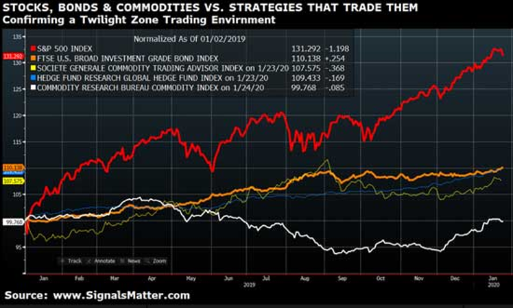
Top-to-bottom, here’s what we see… surprise-surprise: A Twilight Zone trading environment in which market fundamentals have totally left the building. Why? Because stocks (fat red) are ripping way too high compared to bonds (fat orange) and commodities (fat white).
The Experts Are Getting Smacked
Furthermore, and as you can see for yourself, the fancy lads at the hedge funds (thin blue) and CTA’s (thin white) are faring poorly.
Why?
Because their long/short trading strategies are geared to tracking market fundamentals like the bond and interest rate markets (orange), which are now effectively controlled by the Fed, not natural supply and demand. Pure distortion.
Note the extremely high correlation these trading strategies have with bonds in an interest rate market massively suppressed by Fed monetary policy.
Hedge funds and CTAs need free markets and relaible signals from market fundamentals to both manage risk and make sane returns, not imprisoned markets, manipulated by central banks.
After all, hedge funds are designed to “hedge” risk as indicated by market fundamentals, while a Fed supported stock market is designed to just go up, up and away as indicated by Fed steroids.
While CTAs and hedge funds began to make a turn towards profitability last December and this January (capitalizing off the temporary upturn in commodities), the big money is being made…you guessed it…in this monstrously stimulated stock market.
Over the 13-month period in the chart above, normalized returns in stocks have soundly beat bonds and have battered commodities.
Think nosebleed beyond normal market fundamentals, folks, nosebleed…like those 4th-tier nosebleed seats in the 49ers’ stadium, where the tickets are cheap, where it’s lonely, where you can’t see the game beneath and where the risks of simply falling over the side are, well…calculable.
Past performance is never an indicator of future results, folks, and you can take that to the bank, as the rise we are seeing today and yesterday can’t guarantee a similar tomorrow. But when it comes to markets being driven by a central bank rather than market fundamentals (see below), it’s dangerous to fight that Fed, which hedge funds have been trying to do for years…
Sure, we called this melt-up, but that doesn’t mean you shouldn’t be nervous or have a kleenex (i.e. smart risk allocation) ready at such nosebleed levels…
More Nosebleed Indicators Defying Market Fundamentals
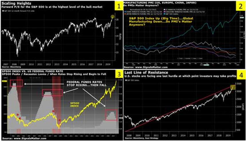
Speaking of nosebleed, below are four more indicators of market fundamentals with seats high up in the bleachers, namely Chart 1 which plots forward P/E ratios for the S&P 500 Index at the highest level in bull market history.
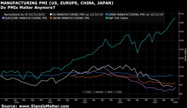
Chart 2 , however, reveals just how rigged and way past market fundamentals this stock market is, as it plots a soaring S&P 500 Index against a tanking Purchasing Manager Index in the U.S., Eurozone, China and Japan.
As you might have guessed, in normal markets driven by old fashioned market fundamentals, stocks fall on such horrific PMI data, but in a post-2008 Fed Market, it’s just about riding the wave and ignoring the rocks beneath it!
Chart 3, plots a spread between the S&P Index and now falling interest rates, a pattern which reliably called the bluff just ahead of past recessions.
Should we be worried? Will history (i.e. a recession) repeat itself? Do such market fundamentals provide any guidance?
In a Twilight Zone, and an election year, it’s simply hard to say, as we’ve never seen a central bank this determined to kick a can and defy market fundamentals. Never. Not ever.
Thus, rather than predict the date and time of the fall, all we can do now is watch those interest rates-as they are now the key indicator of an “Uh-Oh” moment once they start to rise in this new “abnormal” of a Fed driven securities market.
And finally, there’s Chart 4, which plots a last line of resistance for the rising S&P 500. Will more QE and rate cuts (as well as robotically traded ETF purchases) push this rally past the resistance line?
That’s something we’ll be watching carefully.
Storm Tracker
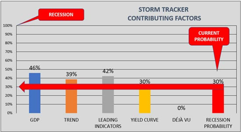
As to our Storm Tracker during all these charades, a modest 30% reading (and hence cash allocation) remains in place as we head into February, and we hope you’ve enjoyed this reduced cash allocation percentage and bull-run, which we called in October…one driven by the Fed, not market fundamentals.
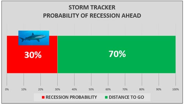
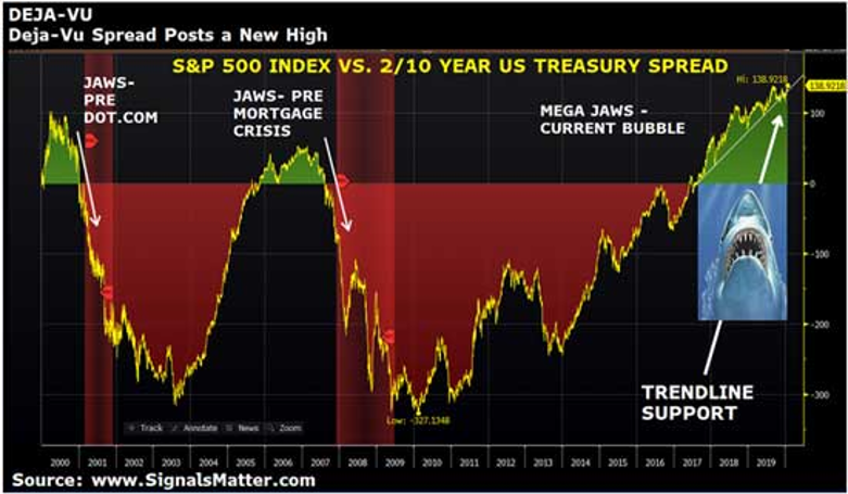
BUT TAKE NOTE: Contributing Factors are changing… namely GDP is deteriorating, trend and leading indicators are worsening, yield curves are trying to invert again, and our Déjà Vu indicator just hit new warning highs as yields fall and stocks rise, thereby opening the “jaws” of a dangerous market “bite” even wider.
Will such warnings signs as to market fundamentals be any reliable guide of risk ahead?
Let’s discuss all this and boil it down for you.
GDP
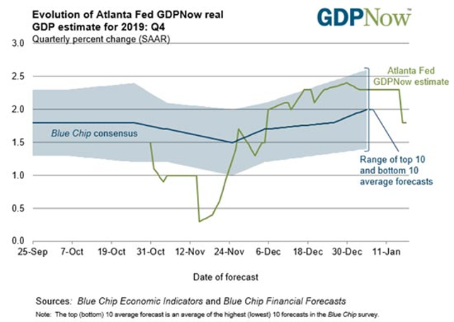
Let’s take growth in Gross Domestic Product (GDP) first. When it comes to market fundamentals, tanking GDP should be a neon flashing sign of red. The Atlanta Fed’s January 17 forecast is not so rosy, having recently dipped to a 1.8% level from a prior 2.3% level not so long ago. Blue Chip consensus has dipped as well.
Global Manufacturing
Global manufacturing (measured by purchasing manager data or PMI’s) is another one of those critical warning bells from the market fundamentals and it too is tumbling, not just in the United States but also in the Eurozone, China and Japan.
Let’s upsize Chart 2 above so we can see what’s happening. The S&P 500 Index, riding on the tailwind of a Fed gone wild and robo traders joining the current, seems not to care at all about such things like, well… market fundamentals…
U.S. Yield Curve
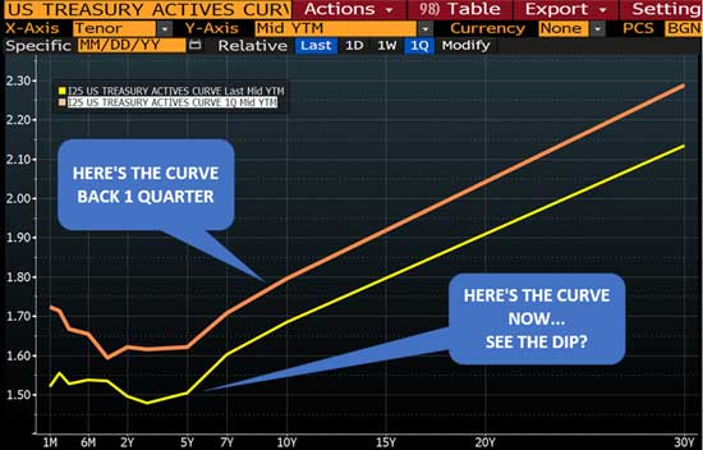
And as to the U.S. Treasury Yield Curve,once considered one of the most reliable indicators of market fundamentals and risk, well… have a look. That brownish curve below is the yield curve one quarter ago. That yellow curve is the yield curve NOW.
See the dip reforming at the short end, suggesting the yield curve could invert all over again? Three segments to the yield curve were inverting at the end of last week, just after the Fed had launched a bazooka to straighten the curve out.
Folks, this is just crazy, and evidences a screaming disconnect between economic pains and a ripping stock market.
Déjà Vu
And amidst such tanking market fundamentals as tumbling GDP growth, contracting global manufacturing, new threats of yield curve inversion and deteriorating trends and leading indicators, Déjà Vu (our trusty ‘canary in the coal mine’ for a next recession) hit new highs last week.
Actually, that makes sense…as the yield curve (interest rates) fall (i.e. the bottom part of the shark’s “jaw”) and stocks make new highs (i.e. the top part of the shark’s “jaw”), the spread (or “recessionary shark jaw”) widens.
Of course, the larger the Déjà Vu spread/jaws widens, the harder it will bite down on currently euphoric investors/markets when yields rise and stocks eventually fall. Trust us and stay tuned on that.
Gobbledygook
We know…this has been a rather technical read, shared this week for two reasons: (1) so you have a grasp of how we watch your back and (2) so you may have a sense of what’s good and what’s bad when it comes to What’s Happening Now.
As you can see, the facts simply confirm that markets driven by QE and repressed rates at the Fed are far more powerful than tanking market fundamentals–for now…
Just Not Thrilled
Last week we laid out the bull case for a continued market rise in this current melt-up, but cautioned not to get too bullish/complacent. And now you know why. Market fundamentals, though no current match for experimental Fed intervention, still matter to informed investors who understand that managing risk is more important than chasing “tops” all-in.
Storm Tracker components are moving around, offsetting one another for now but threaten to accumulate to the downside for a defensive reading-and thus a higher protective cash allocation.
To be blunt, we are just not thrilled with the market fundamentals we are seeing, notwithstanding our broader view as to why the U.S. could continue to rise relative to other countries.
Macro vs. micro. They both count and that’s where we are now, riding this bull and bear rodeo with tight reins.
Your Portfolio
For Signals Matter subscribers, keep your eyes on our changing allocations, which move as markets move. At least for now, it’s fairly clear these markets move on Fed action rather than market fundamentals.
Current positioning tilts to the bullish side for now (because that’s what working now) and includes allocations to technology (iShares Expanded Tech-Software EFT, symbol IGV, which tracks the S&P North American Expanded Technology Software Index), disruptive innovation (ARK Innovation ETF, symbol ARK, that thematically invests in disruptive technologies) and medical devices (iShares U.S. Medical Devices, symbol IHI, that tracks the Dow Jones U.S. Select Medical Equipment Index).
All in, including a Storm Tracker Cash Allocations, Your Portfolio of current positions is up 5.09% for the month (2X the S&P 500 Index). And yes, that wasn’t a typo…that’s including a hefty cash hedge. You see, being conservatively invested in cash as a safeguard is just plain safe…and need not reduce overall portfolio performance.
Your Portfolio positions will and DO change with the market winds (Storm Tracker) and What’s Working Now, which include ETF picks constructed in Portfolio Builder, which our subscribers can check at their leisure.
Bottom Line, gobbledygook aside, all you’ll really need to do is let us do the driving and informing. How’s all that sound to you?
Sincerely,
Matt & Tom


