Market reality seems increasingly draped in market noise. This means many investors feel helpless.
As Always, the Media is Clueless
Another Friday is here and I’m enjoying an AM coffee and baguette on the terrace, reading the near endless stream of media-hype and never-ending, fear-based bad news that seems to keep U.S. “journalists” forever dividing consensus.
Whether debating history (and monuments), infection rates vs death rates, open borders vs closed borders, left vs right, Trump vs Biden, 5G vs OMG, vaccines vs science or just plain blunt information vs propaganda, it’s pretty clear that the modern mix of mis-information, over-information and just bad information is now the norm.
This same blender of media noise and fog is no different when it comes to reporting on the financial markets, which “reporting” has almost nothing to do with market reality.
As central bankers, pundits and politicos of every stripe fight like donkey’s for scraps of hay and public airtime, the lighthouse of candid, simple and transparent facts gets deliberately lost in the fog of click-bait journalism and election-focused politico grandstanding.
Investors are bombarded with sound-bite crumbs on everything from bear vs bull apologists to the latest stock or strategy de jour, most of which borders on the reckless and almost criminally negligent.
The Hucksters and Spin Sellers
Younger investors are downloading apps on options trading as if levered puts and calls were as amusing and simple as a video game, which explains the recent suicide by a 20-year-old Robinhood app user who took his own life after trading himself into $700,000+ trading loss.
In short, investing is not a game.
Apps, pundits or online hucksters selling penny stock courses or option-trading miracle-solutions to inexperienced dreamers deserve a blindfold and cigarette.
And if you look closely behind the curtain of their “market experience,” you’ll note that the vast majority of these “get-rich-quick promoters” have next to zero market knowledge but a great deal of marketing knowledge.
Of course, markets and marketing are two very different disciplines.
SignalsMatter.com—Deep Experience, Blunt Advice
Tom and I created Signals Matter to share decades of market knowledge, and we know this much: There’s a deep and urgent need to share investment direction plainly with real rather than fantasy solutions.
For knowledge-thirsty investors, we recognize your frustrations.
It can be extremely difficult to know just what to think about market reality, present and future, in the backdrop of so many opinions ricocheting through your inbox or online searches for market reality and actionable advice.
That’s why we like to mix a few stubborn notions like facts and data into our deliberately educational reports on market reality and portfolio guidance.
Facts are Stubborn Things
Sure, opinions are interesting. Everybody has them—from CNN to FOX News.
But facts are stubborn things, and if presented with common sense rather than marketing gimmicks, they slowly become the needed lighthouse in an otherwise dangerously thick fog of financial marketing spin rather than market reality.
Toward that end, I thought I’d close the week with four more charts that are undeniably informative not only in their blunt simplicity, but also for their equally blunt implications as to current market reality and what’s ahead.
Indeed, these are the kind of facts forever on our radar as we make market-beating portfolio suggestions year after year for our loyal subscribers.
As always, if you prefer market reality, insight and transparent portfolio recommendations over marketing tricks or sell-side fantasy, just join us by clicking here and will guide your portfolio safely through this thickening market fog.
OK, so let’s get back to the lighthouse.
Chart 1–Debt
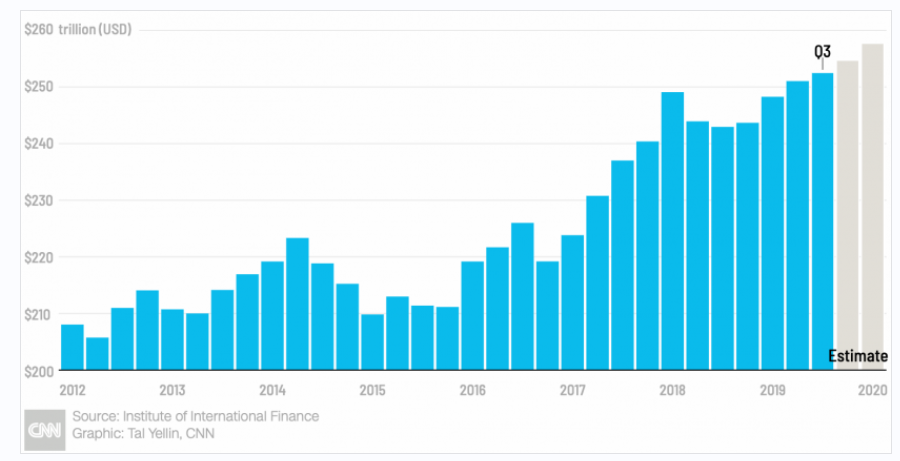
First, if you simply want to know the single most important theme that not only explains the tailwind of the post-2008 “recovery” as well as the next headwind for the post-COVID stagnation, it all boils down to one simple word: DEBT.
The simple fact is that the world is literally drowning in debt at record ($260 T) levels. See for yourself:

It’s also an equally quantifiable fact that every market and economic collapse in history is preceded by a debt-bubble, and the foregoing debt bubble is now beyond debate. Be warned.
Chart 2—Fiat Fantasy
Ah, but what about the good times? Doesn’t debt, paid for by printed money and Fed “accommodation” create miracles?
Well, yes.
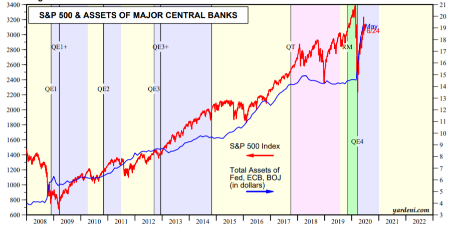
That’s why the Fed and all the other major central banks of the world have printed trillions and trillions of fiat dollars as per the chart below to pay for our embarrassing, post-2008 debt with miracle-like hubris.
Needless to say, such debt, like a shiny new credit card, buys a lot of memorable Friday nights, as the following correlation between central bank money printing (i.e. “QE”) and the S&P’s gravity-defying rise confirms:

Seems pretty cool, no? Just borrow, print and spend, then rinse and repeat and all will be fine as the central banks miraculously outlaw recessions with magic fiat money backed by, well…nothing.
After all, whenever money is printed (see rising blue line), the markets rise (see rising red line).
And whenever the printing stops or “tightens” (i.e. “Quantitative Tightening” or “QT”) shown above, the markets then tank.
So, all we need to do is just keep borrowing, printing and spending, right?
Pretty simple? Pretty obvious?
Chart 3—Thriving on Big Debt and no Income. Too Good to Be True?
But let’s not kid ourselves folks. Like those penny stock hustlers and option-trading “wonder apps”—we all kinda just know they’re…well: Crap.
And the idea that the central banks can just print our markets and economy into an ever-rising Promise Land is equally just a lot of, well… horse crap.
Deep down, we just know this, even if some folks never (like those penny-stock hucksters) read a single chapter from an economic text book.
Why horse crap?
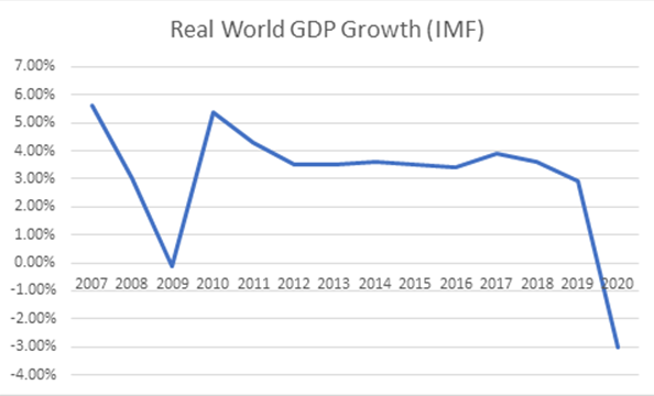
Well, we’ve explained this in far greater detail here, here and here, but for now it just boils down to common sense and one more stubbornly inconvenient piece of market data, namely the difference between what the world economy owes (see debt pile above) and what it earns (see GDP slide below).
The following GDP fact paints a horrifically blunt market reality:

Whether you run a family, a personal budget, a company or a nation, it should be fairly obvious that when your debt is skyrocketing and your income is tanking, that’s probably not the best time to take that Parisian vacation or make a Range Rover purchase.
Nor is it the best time for a portfolio to place all its faith in a debt-soaked, over-valued market.
Yet for now, the financial media is still suggesting that it somehow makes sense for markets to regain (and maintain) record highs in the backdrop of a global recession and tanking, and I mean TANKING, GDP levels.
In sum, despite a minimum wage income and a grand-canyon deep debt problem, Wall Street and the Fed want you to believe we can spend like a diamond-clad, 19th century fancy lad.
But don’t be fooled.
Even if markets rise on central-bank steroids, the real economy is rotting from within, which is why I warned over a year ago (see video below) that the next recession would start on Main Street, not a Fed-coddled Wall Street.
History, at least this time, has proven me correct.
While Wall Street Enjoys the Party, Main Street Rots from the Bottom Up
Asking the Wrong Questions
Frankly, the question of whether or not the markets, juiced by central bank steroids, can forever rise past history and common sense (they can’t and won’t), isn’t even the real issue, for regardless of what the stock markets do, the damage to our economies and currencies has already been done.
In short, we are knee deep in the horse crap right now, and have been for quite some time.
For more fact-based confirmation of this, just consider the dying middle class, the Wall Street ignored Main Street and the gross unemployment lies we’ve reported upon here and here.
Equally, if not more important for those of you with money in the markets or even buried under a mattress or deposited at a private bank (effectively the same thing when it comes to earning interest), the most deliberately ignored fact (and market sin) denied to you by the main stream fog media is even more simple and horrific.
Chart 4–The Most Ignored Risk of All: Your Currency
Namely, every dollar you own, whether it be hundreds, thousands, millions or more, is losing it’s purchasing power by the hour, minute and second. This has nothing to do with reported CPI inflation tricks, just a 30% increase in money supply for 2020 alone.
And whether you be a bear or bull, an investor or a gambler, a saver or a spender, each dollar you count with either pride or concern is getting less and valuable per day as central bankers around the globe dilute (destroy) its purchasing power.
That’s why we spend as much time protecting your portfolio as we do protecting your wealth, and that’s also why we look at precious metals with a serious eye toward facts not “gold bug” marketing.
And that is also why I’ll leave you with more facts, rather than opinions, to let these blunt yet publicly (and deliberately) ignored facts sink in.
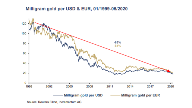
That is, when measured against gold, the purchasing power of your Dollar or Euro (two currencies close to my heart) just keeps vanishing before your eyes.
Don’t want to believe me? Again: Just open your eyes and see for yourself:

Have a great weekend.
Sincerely, Matt & Tom


